🔶 What is a Box Shadow?
The box-shadow property in CSS adds shadow effects around an element's box, like cards, divs, or buttons.
✅ Basic Syntax
box-shadow: offset-x offset-y blur-radius spread-radius color;All except color are length values (in px, em, etc.).
🔹 Example 1: Basic Shadow
<body>
  <div class="box1">Box with Shadow</div>
</body>
.box1 {
box-shadow: 5px 5px 10px gray;
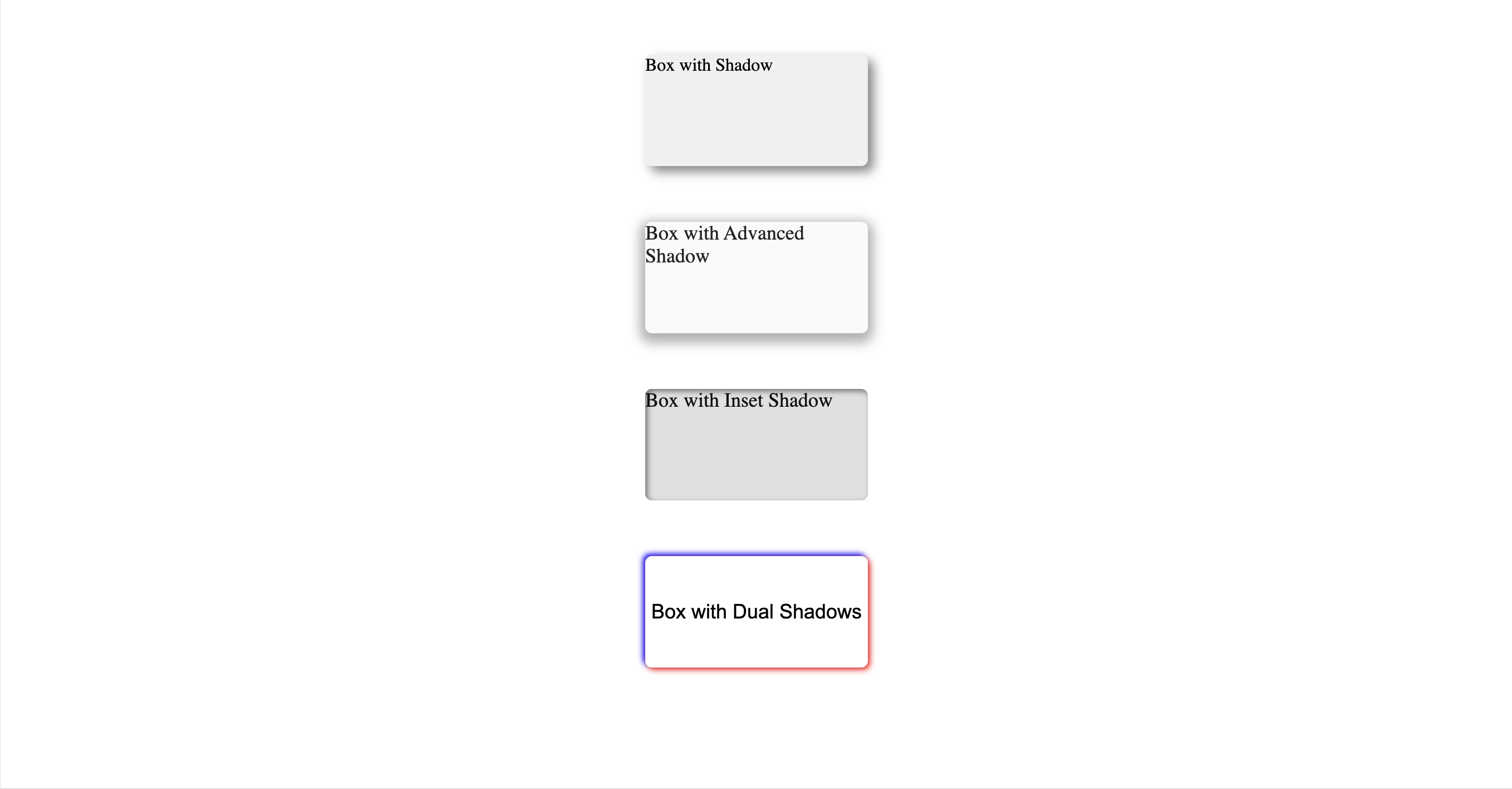
}🧠 Explanation:
Shadow is pushed 5px right and 5px down.
It blurs with a 10px softness.
Appears like the box is slightly raised off the page.
🔹 Example 2: Shadow with Spread
<body>
  <div class="box2">Box with Advanced Shadow</div>
</body>
.box2 {
box-shadow: 0px 4px 10px 5px rgba(0, 0, 0, 0.3);
}🧠 Explanation:
The shadow spreads outward more due to the 5px spread-radius.
Gives a wider and softer feel.
Looks like a strong glow behind the element.
🔹 Example 3: Inset Shadow (inside the box)
<body>
  <div class="box3">Box with Inset Shadow</div>
</body>
.box3 {
box-shadow: inset 2px 2px 5px rgba(0, 0, 0, 0.5);
}🧠 Explanation:
Shadow is rendered inside the element.
Looks like the element is pressed in or hollow.
Great for neumorphism and modern UI designs.
🔹 Example 4: Multiple Shadows
<body>
  <div class="box4">Box with Dual Shadows</div>
</body>
.box4 {
box-shadow: 2px 2px 5px red, -2px -2px 5px blue;
}🧠 Explanation:
One red shadow to the bottom-right
One blue shadow to the top-left
Creates a glow or 3D color effect
✅ Playground
<!DOCTYPE html>
<html>
<head>
<meta charset="UTF-8">
<title>Box Shadow Lab</title>
<style>
  .infographic-shadowlab {
    --ink:        #1a1a1a;
    --ink-soft:   #5c5c5c;
    --paper:      #ffffff;
    --paper-alt:  #f0ece4;
    --accent:     #2563eb;
    --accent-soft:#e3ebfd;
    --line:       #ddd6c9;
    box-sizing: border-box;
    margin: 0 auto;
    font-family: -apple-system, BlinkMacSystemFont, "Segoe UI", Roboto, Helvetica, Arial, sans-serif;
    background: var(--paper);
    color: var(--ink);
    border-radius: 14px;
    overflow: hidden;
  }
  .infographic-shadowlab[data-theme="dark"] {
    --ink:        #e8e6e1;
    --ink-soft:   #9a968c;
    --paper:      #121212;
    --paper-alt:  #1e1e26;
    --accent:     #5b8def;
    --accent-soft:#202942;
    --line:       #2c313d;
  }
  .ha-inner { padding: 0.5rem; }
  .ha-layout { display: flex; flex-direction: column; gap: 1.1rem; }

  .ha-pills {
    display: flex;
    flex-wrap: wrap;
    gap: 0.5rem;
  }
  .ha-pill {
    border: 1px solid var(--line);
    background: var(--paper);
    color: var(--ink);
    font-family: "SFMono-Regular", Consolas, monospace;
    font-size: 0.78rem;
    font-weight: 700;
    padding: 0.45rem 0.8rem;
    border-radius: 8px;
    cursor: pointer;
    transition: background 0.15s ease, color 0.15s ease, border-color 0.15s ease;
  }
  .ha-pill:hover { border-color: var(--accent); }
  .ha-pill.ha-on { background: var(--accent); border-color: var(--accent); color: #fff; }

  .ha-stage {
    background: var(--paper-alt);
    border: 1px solid var(--line);
    border-radius: 10px;
    padding: 2.2rem 1rem;
    display: flex;
    align-items: center;
    justify-content: center;
    min-height: 150px;
  }
  #ha-box {
    width: 170px;
    height: 90px;
    border-radius: 6px;
    display: flex;
    align-items: center;
    justify-content: center;
    font-size: 0.85rem;
    text-align: center;
    padding: 0.5rem;
    transition: box-shadow 0.15s ease, background 0.2s ease, color 0.2s ease;
  }

  .ha-controls {
    display: flex;
    flex-direction: column;
    gap: 0.6rem;
  }
  .ha-controls.ha-disabled { opacity: 0.4; pointer-events: none; }
  .ha-slider-row {
    display: grid;
    grid-template-columns: 88px 1fr 46px;
    align-items: center;
    gap: 0.6rem;
  }
  .ha-slider-row label {
    font-family: "SFMono-Regular", Consolas, monospace;
    font-size: 0.75rem;
    color: var(--ink-soft);
  }
  .ha-slider-row input[type="range"] {
    width: 100%;
    accent-color: var(--accent);
  }
  .ha-slider-row .ha-val {
    font-family: "SFMono-Regular", Consolas, monospace;
    font-size: 0.75rem;
    color: var(--ink-soft);
    text-align: right;
  }
  .ha-toggle-row {
    display: flex;
    align-items: center;
    gap: 0.5rem;
    font-family: "SFMono-Regular", Consolas, monospace;
    font-size: 0.78rem;
  }

  .ha-code {
    background: #0b0b0b;
    border: 1px solid #2a2a2a;
    border-radius: 10px;
    padding: 0.8rem 1.8rem 0.8rem 0.9rem;
    font-family: "SFMono-Regular", Consolas, "Liberation Mono", Menlo, monospace;
    font-size: 0.82rem;
    color: #e5e5e5;
    overflow-x: auto;
    white-space: pre;
  }
  .ha-code .ha-prop { color: #c586c0; }
  .ha-code .ha-val-hl { color: #ffd166; font-weight: 700; }
  .ha-code .ha-sel { color: #f472b6; font-weight: 700; }

  .ha-note {
    font-size: 0.78rem;
    color: var(--ink-soft);
  }
</style>
</head>
<body>

<div class="infographic-shadowlab" id="ha-root">
  <div class="ha-inner">
    <div class="ha-layout">

      <div class="ha-pills" id="preset-pills">
        <button class="ha-pill ha-on" data-preset="basic">Basic</button>
        <button class="ha-pill" data-preset="spread">Spread</button>
        <button class="ha-pill" data-preset="inset">Inset</button>
        <button class="ha-pill" data-preset="multi">Multiple</button>
      </div>

      <div class="ha-stage">
        <div id="ha-box">Box with Shadow</div>
      </div>

      <div class="ha-controls" id="controls">
        <div class="ha-slider-row">
          <label>offset-x</label>
          <input type="range" id="s-x" min="-20" max="20" value="5">
          <span class="ha-val" id="v-x">5px</span>
        </div>
        <div class="ha-slider-row">
          <label>offset-y</label>
          <input type="range" id="s-y" min="-20" max="20" value="5">
          <span class="ha-val" id="v-y">5px</span>
        </div>
        <div class="ha-slider-row">
          <label>blur</label>
          <input type="range" id="s-blur" min="0" max="40" value="10">
          <span class="ha-val" id="v-blur">10px</span>
        </div>
        <div class="ha-slider-row">
          <label>spread</label>
          <input type="range" id="s-spread" min="-10" max="20" value="0">
          <span class="ha-val" id="v-spread">0px</span>
        </div>
        <div class="ha-toggle-row">
          <input type="checkbox" id="s-inset">
          <label for="s-inset">inset</label>
        </div>
      </div>

      <div class="ha-code" id="code-out"></div>

      <div class="ha-note" id="note-out"></div>

    </div>
  </div>
</div>

<script>
(function () {
  const wrapper = document.getElementById('ha-root');
  const bodyAttr = document.body.getAttribute('data-darkmode');
  let dark;
  if (bodyAttr === 'true') {
    dark = true;
  } else if (bodyAttr === 'false') {
    dark = false;
  } else {
    const match = document.cookie.match(/(?:^|;\s*)darkMode=([^;]+)/);
    dark = match ? match[1] === 'true' : false;
  }
  if (dark) wrapper.setAttribute('data-theme', 'dark');
})();

(function () {
  const box = document.getElementById('ha-box');
  const controls = document.getElementById('controls');
  const codeOut = document.getElementById('code-out');
  const noteOut = document.getElementById('note-out');

  const sx = document.getElementById('s-x');
  const sy = document.getElementById('s-y');
  const sblur = document.getElementById('s-blur');
  const sspread = document.getElementById('s-spread');
  const sinset = document.getElementById('s-inset');

  const vx = document.getElementById('v-x');
  const vy = document.getElementById('v-y');
  const vblur = document.getElementById('v-blur');
  const vspread = document.getElementById('v-spread');

  const presets = {
    basic: {
      x: 5, y: 5, blur: 10, spread: 0, inset: false, color: 'gray',
      bg: '#f0f0f0', text: 'Box with Shadow',
      note: 'Pushed 5px right, 5px down, with a 10px soft blur — like the box is slightly raised off the page.'
    },
    spread: {
      x: 0, y: 4, blur: 10, spread: 5, inset: false, color: 'rgba(0,0,0,0.3)',
      bg: '#fafafa', text: 'Box with Advanced Shadow',
      note: 'A positive spread pushes the shadow outward beyond the blur alone — wider, softer, more like a glow.'
    },
    inset: {
      x: 2, y: 2, blur: 5, spread: 0, inset: true, color: 'rgba(0,0,0,0.5)',
      bg: '#e0e0e0', text: 'Box with Inset Shadow',
      note: 'The inset keyword flips the shadow to render inside the box — looks pressed in, not raised.'
    }
  };

  let mode = 'basic';

  function applyPreset(name) {
    mode = name;
    document.querySelectorAll('.ha-pill').forEach(p => p.classList.toggle('ha-on', p.getAttribute('data-preset') === name));

    if (name === 'multi') {
      controls.classList.add('ha-disabled');
      box.style.background = '#ffffff';
      box.style.color = '#000';
      box.style.boxShadow = '2px 2px 5px red, -2px -2px 5px blue';
      box.textContent = 'Box with Dual Shadows';
      codeOut.innerHTML = '<span class="ha-prop">box-shadow</span>: <span class="ha-val-hl">2px 2px 5px red</span>, <span class="ha-val-hl">-2px -2px 5px blue</span>;';
      noteOut.textContent = 'Two shadows, comma-separated: one red toward the bottom-right, one blue toward the top-left — a two-tone glow.';
      return;
    }

    controls.classList.remove('ha-disabled');
    const p = presets[name];
    sx.value = p.x; sy.value = p.y; sblur.value = p.blur; sspread.value = p.spread; sinset.checked = p.inset;
    box.style.background = p.bg;
    box.style.color = '#111';
    box.dataset.color = p.color;
    box.textContent = p.text;
    render();
    noteOut.textContent = p.note;
  }

  function render() {
    const x = sx.value, y = sy.value, blur = sblur.value, spread = sspread.value, inset = sinset.checked;
    const color = box.dataset.color || 'gray';
    vx.textContent = x + 'px'; vy.textContent = y + 'px'; vblur.textContent = blur + 'px'; vspread.textContent = spread + 'px';

    const shadowVal = (inset ? 'inset ' : '') + x + 'px ' + y + 'px ' + blur + 'px ' + spread + 'px ' + color;
    box.style.boxShadow = shadowVal;

    codeOut.innerHTML = '<span class="ha-prop">box-shadow</span>: <span class="ha-val-hl">' +
      (inset ? 'inset ' : '') + x + 'px ' + y + 'px ' + blur + 'px ' + spread + 'px</span> ' + color + ';';
  }

  [sx, sy, sblur, sspread, sinset].forEach(el => el.addEventListener('input', render));

  document.getElementById('preset-pills').querySelectorAll('.ha-pill').forEach(btn => {
    btn.addEventListener('click', () => applyPreset(btn.getAttribute('data-preset')));
  });

  applyPreset('basic');
})();
</script>

</body>
</html>
.demo {
font-family: system-ui, sans-serif;
padding: 16px;
}
.demo h1 {
color: #2563eb;
margin: 0 0 8px;
}
.demo p {
color: #4b5563;
margin: 0;
}document.querySelector('.demo h1')?.addEventListener('click', () => {
alert('Hello from live preview!');
});🧠 Full Code Example
<!DOCTYPE html>
<html lang="en">
  <head>
    <meta charset="UTF-8" />
    <title>Box Shadow Example</title>
    <link rel="stylesheet" href="style.css" />
  </head>
  <body>
    <div class="box1">Box with Shadow</div>
    <div class="box2">Box with Advanced Shadow</div>
    <div class="box3">Box with Inset Shadow</div>
    <div class="box4">Box with Dual Shadows</div>
  </body>
</html>
.box1 {
width: 200px;
height: 100px;
background-color: #f0f0f0;
box-shadow: 5px 5px 10px gray;
margin: 50px auto;
border-radius: 6px;
}
.box2 {
width: 200px;
height: 100px;
background-color: #fafafa;
box-shadow: 0px 4px 10px 5px rgba(0, 0, 0, 0.3);
margin: 50px auto;
display: flex;
font-size: 18px;
color: #222;
border-radius: 6px;
}
.box3 {
width: 200px;
height: 100px;
background-color: #e0e0e0;
box-shadow: inset 2px 2px 5px rgba(0, 0, 0, 0.5);
margin: 50px auto;
font-size: 18px;
color: #111;
border-radius: 6px;
}
.box4 {
width: 200px;
height: 100px;
background-color: #ffffff;
box-shadow: 2px 2px 5px red, -2px -2px 5px blue;
margin: 50px auto;
display: flex;
justify-content: center;
align-items: center;
font-family: Arial, sans-serif;
font-size: 18px;
color: #000;
border-radius: 6px;
}
📊 Comparison Table
Syntax Example | Effect |
|---|---|
5px 5px 10px gray | Basic drop shadow |
0px 4px 10px 5px rgba(0,0,0,0.3) | Wider, blurred shadow |
inset 2px 2px 5px rgba(0,0,0,0.5) | Inner shadow |
2px 2px 5px red, -2px -2px 5px blue | Double colored shadows |