🧠 What is a Fluid Layout?
A fluid layout uses percentage-based widths instead of fixed pixel (px) values.
It adapts to the width of the browser window or parent container.
It's a type of responsive design technique that scales with screen size.
🔍 Think of it like water — fluid layouts stretch and shrink like fluid inside any container.
💡 Why Use Fluid Layouts?
🧩 Makes your layout flexible across various screen sizes.
📱 No horizontal scroll on smaller devices.
🔁 Works well with media queries and viewport units.
💻 Ideal for creating layouts that scale naturally.
✅ Example of Fluid Layout
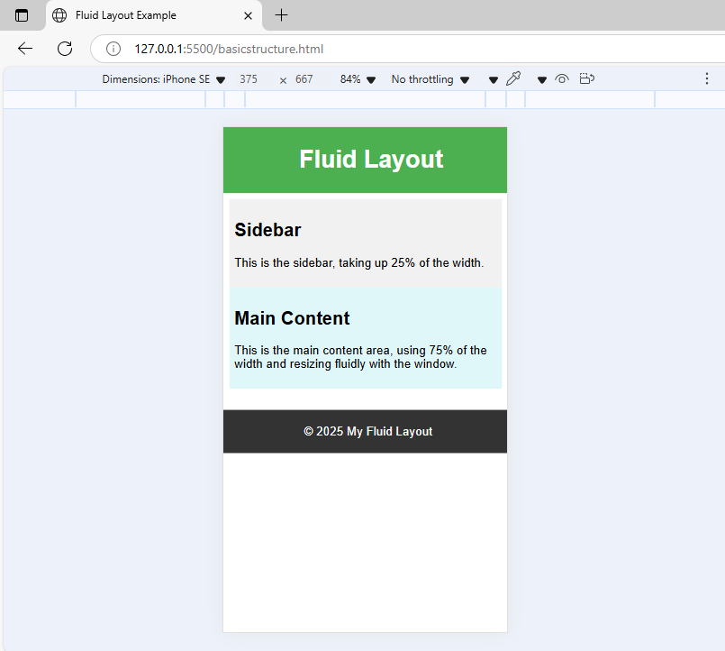
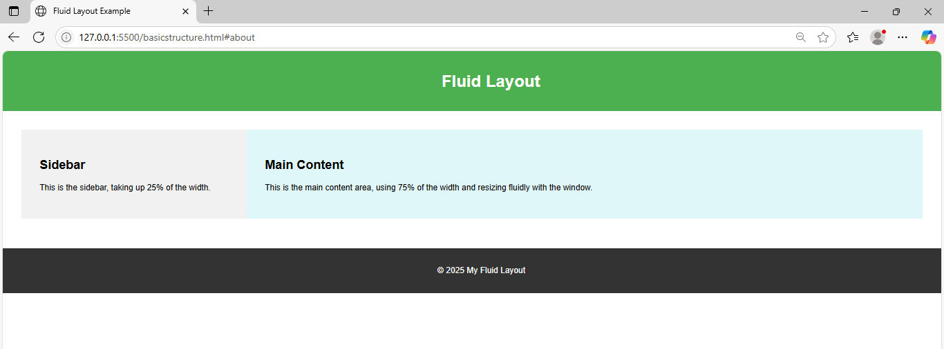
<body>
<div class="container">
<aside class="sidebar">
<h2>Sidebar</h2>
<p>This is the sidebar, taking up 25% of the width.</p>
</aside>
<main class="main-content">
<h2>Main Content</h2>
<p>
This is the main content area, using 75% of the width and resizing
fluidly with the window.
</p>
</main>
</div>
<footer class="footer">
<p>© 2025 My Fluid Layout</p>
</footer>
</body>/* General page styles */
body {
margin: 0;
font-family: Arial, sans-serif;
}
/* Header */
.header {
width: 100%;
background-color: #4caf50;
color: white;
padding: 1% 2%;
text-align: center;
}
/* Container holding sidebar + main content */
.container {
display: flex;
flex-wrap: wrap;
width: 100%;
padding: 2%;
box-sizing: border-box;
}
/* Sidebar */
.sidebar {
width: 25%;
padding: 2%;
background-color: #f1f1f1;
box-sizing: border-box;
}
/* Main content */
.main-content {
width: 75%;
padding: 2%;
background-color: #e0f7fa;
box-sizing: border-box;
}
/* Footer */
.footer {
width: 100%;
background-color: #333;
color: white;
text-align: center;
padding: 1%;
margin-top: 20px;
}
/* Responsive stacking */
@media screen and (max-width: 768px) {
.sidebar,
.main-content {
width: 100%;
}
}
🧮 Comparison Table
Layout Type | Width Unit | Responsive? | Scroll Risk |
|---|---|---|---|
Fixed Layout | px | ❌ No | ✅ High |
Fluid Layout | % / vw | ✅ Yes | ❌ Low |
Responsive Layout | % + media queries | ✅✅ Best | ❌ Very Low |
💡You can use vw (viewport width) and vh (viewport height) for even smoother design.
📌 Best Practices
Use max-width with fluid layouts to avoid stretching too much.
Combine % widths with media queries for finer control.
Test on different devices to ensure smooth scaling.